Mobile productivity app
Wtask
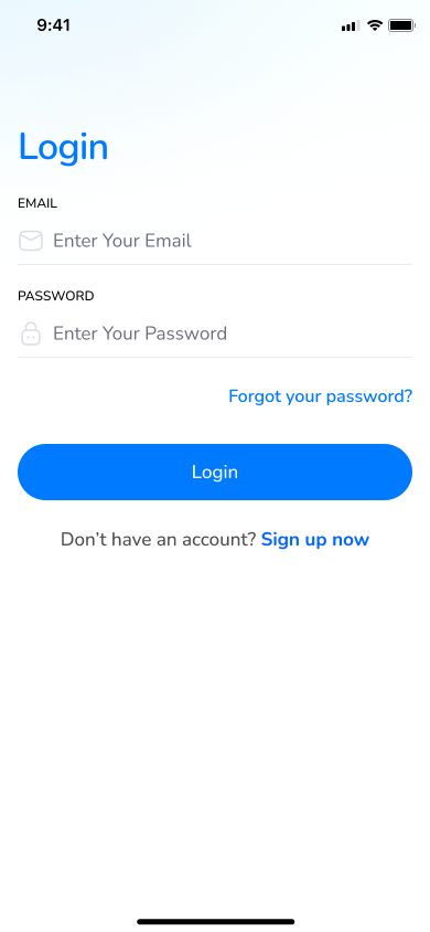
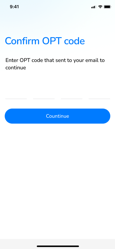
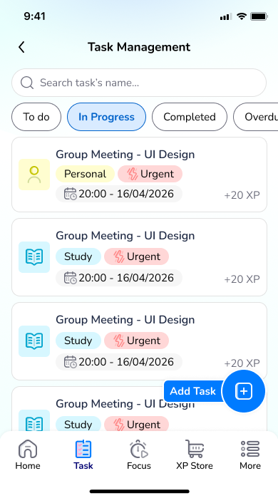
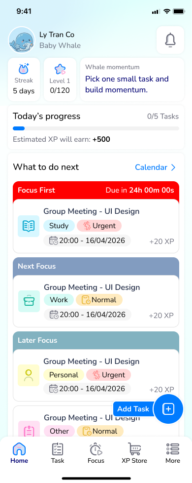
A study planning app designed for university students who need to balance coursework, group assignments, part-time jobs, and personal well-being without losing momentum.

Project context
A mobile productivity and study planning app designed specifically for university students juggling multiple commitments: coursework, group assignments, part-time jobs, and personal well-being.
Project outcome
The final outcome is a comprehensive mobile solution that empowers university students to optimize their productivity, allowing them to seamlessly balance coursework, part-time jobs, and personal well-being.
What i did:
To tackle this challenge effectively, I anchored my workflow in the Design Thinking framework. Rather than a linear A-to-Z path, this iterative approach allowed me to continuously test, validate, and refine concepts alongside the target users before finalizing the solution.
Phrase 1
Discovery & Research
Problem Definition
A to-do list is not the only key to effective time management when balancing a part-time job with my studies. It should be adaptable in order to react to any unexpected events. On most occasions, I tend to be overwhelmed and reactive when I have to meet deadlines, when there are various platform-spread tasks, learning management systems, group chats, and calendars. However, I suppose that, as tools and tactics improve, I will be able to develop a more systematic approach, eliminating stress and improving my productivity.
There were two key research questions leading to this work:
RQ1: What are the primary challenges that students encounter in organizing study activities, schedule, in group work and combining part-time work?
RQ2: What would assist students in planning better, become less stressed and more engaged with their workload in the long term?
Target users
- Level 8, Level 9 students
- Particularly individuals who have to juggle group assignments and/or part-time jobs.
Methods
Survey: 26 responses (student workload, tools, pain points, feature preferences)
User interviews: 5 participants (10-15 mins each)
Survey questions
A survey was conducted via Google Form and sent to students currently studying in Ireland.
Form's url: https://forms.gle/nMhFux5ei5TRrmCZA

Survey statistic
The survey was mostly sent to Postgrad students

The chart shows that most students completed between 8 and 20 task each week

User interview
To drive deeply and confirm the insight from the survey. I conducted an interview with 5 students
After coding interview and doing thematic analysis
i came to serveral painpoint and core need

Interview Findings: Key Pain Points
Pain Point 1: Unclear Prioritization
"Unclear prioritisation when deadlines overlap"
When multiple assignments due in same week: which to prioritize?
Students lack framework to assess urgency + importance + effort
Pain Point 2: Manual Data Entry Friction
"High friction to keep tools updated"
Manual entry of tasks takes time and feels like overhead
Reduces motivation to use the app consistently
Deadlines exist in multiple places (syllabus, email, LMS)
Pain Point 3: Plan Breakdowns
"Plan breakdowns with unpredictable schedules"
Fixed plans fail when: Classes get rescheduled, work shift changes suddenly, group members cancel meetings. Students need flexible, adaptive planning.
Pain Point 4: Overwhelm & Task Initiation
"Overwhelm / difficulty starting big tasks"
Large assignments ("write a 5,000-word essay") feel paralyzing. Lack of visible breakdown makes it hard to take first step. Procrastination spirals from inaction -> guilt -> more avoidance.
Pain Point 5: Distraction During Execution
"Distraction during execution"
Even with a plan, students struggle to stay focused. No support for maintaining momentum during work sessions. External notifications and context-switching break flow.
Findings: "Design Requirements"
- Reduce manual input (defaults, templates, auto import/sync)
- Make priorities visible (urgency/importance + effort/time)
- Turn deadlines into a plan (time blocks / study sessions)
- Help students start (task breakdown, first-step prompts)
- Support recovery when plans change (auto-reschedule)
Phrase 2
Solution Concept
Ideation & Structure
How might we ideation
HMW 1 - How might we reduce cognitive load of multiple platforms?
Solves: Information overload
Solution: Unified task consolidation hub
HMW 2 - How might we make big tasks less intimidating?
Solves: Procrastination, task initiation anxiety
Solution: Auto-breakdown, first-step prompts
HMW 3 - How might we create realistic schedules students will follow?
Solves: Poor time management, cramming
Solution: AI estimates, distributed across days
HMW 4 - How might we help students enter and maintain flow state?
Solves: Distraction, execution problems
Solution: Pomodoro timer, focus mode
HMW 5 - How might we sustain motivation over the entire semester?
Solves: Low engagement, motivation drop
Solution: Streaks, varied rewards, progression system
Storyboard
Scenario: A stressed student receives multiple assignments from different courses. She discovers the Study Planner app that helps her organize tasks, break them down into manageable steps, and track her progress with gamification. By using the app's smart scheduling and focus features, she completes her assignments on time with less stress and feels accomplished.

Brainstorming flow

Task flow


Phrase 3
Wireframes & Usability Testing
Design & Validation
Wireframes


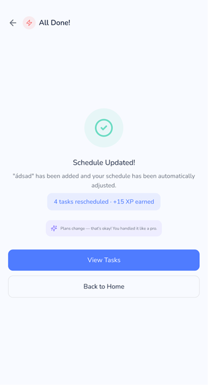
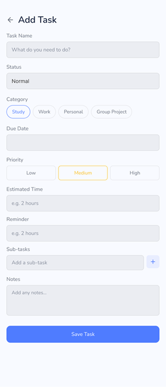
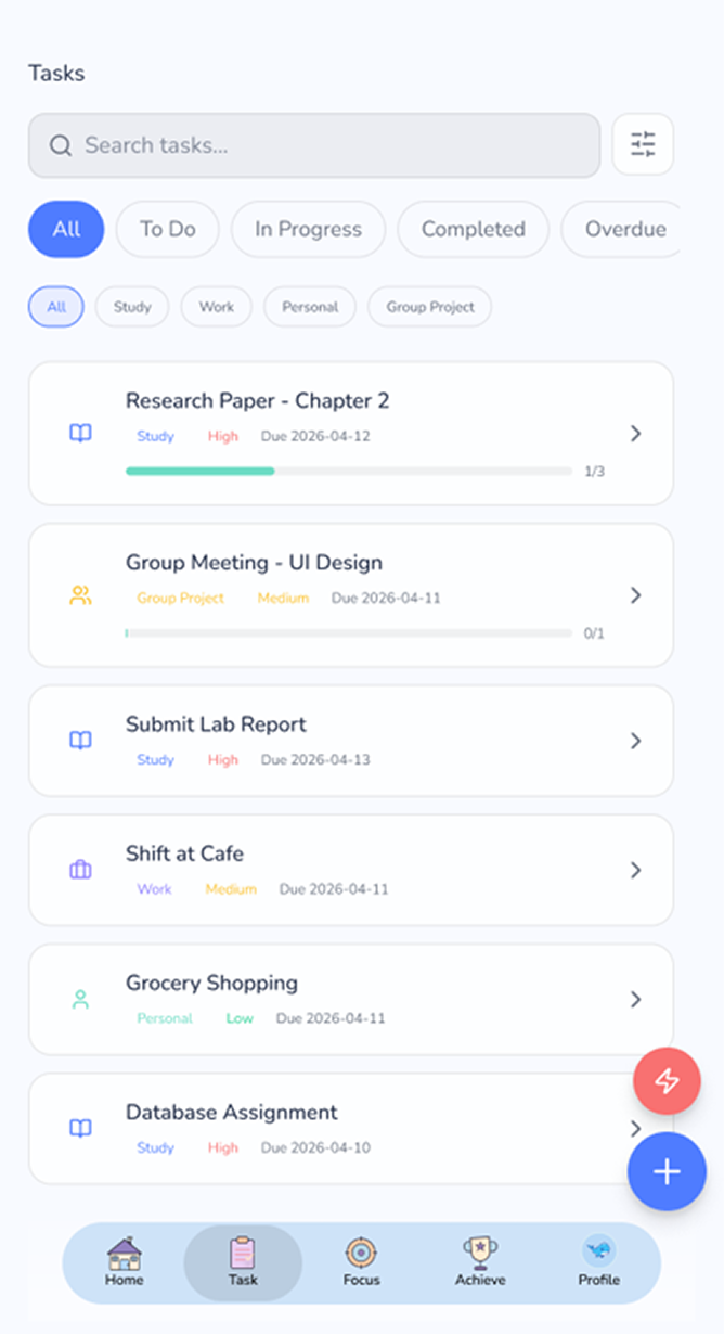

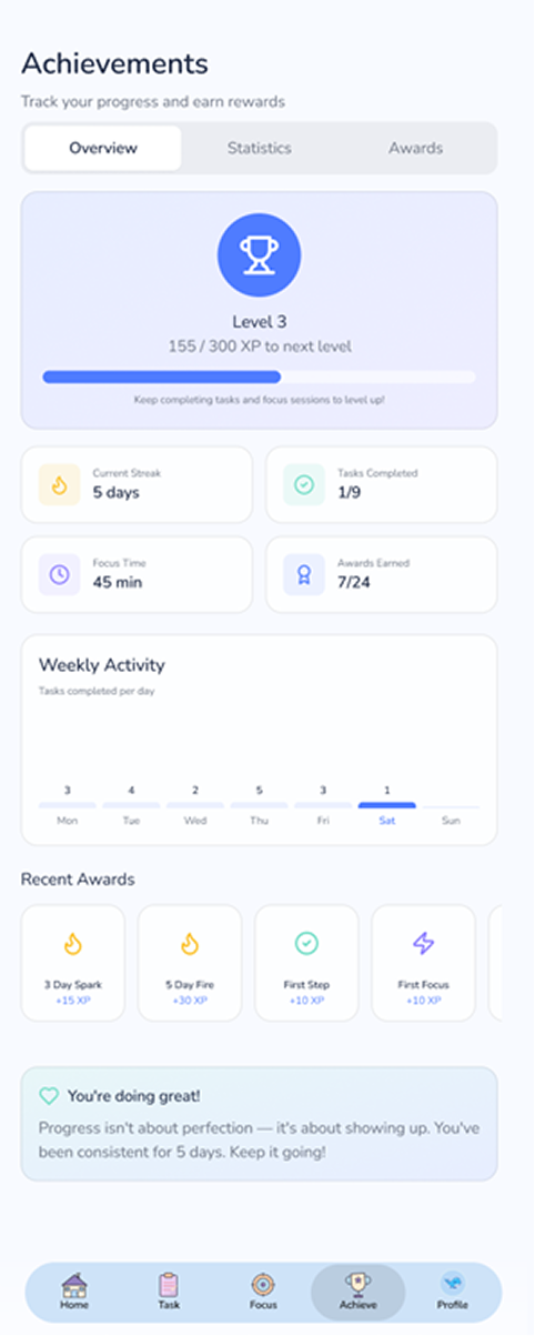
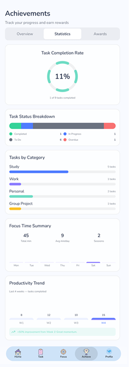

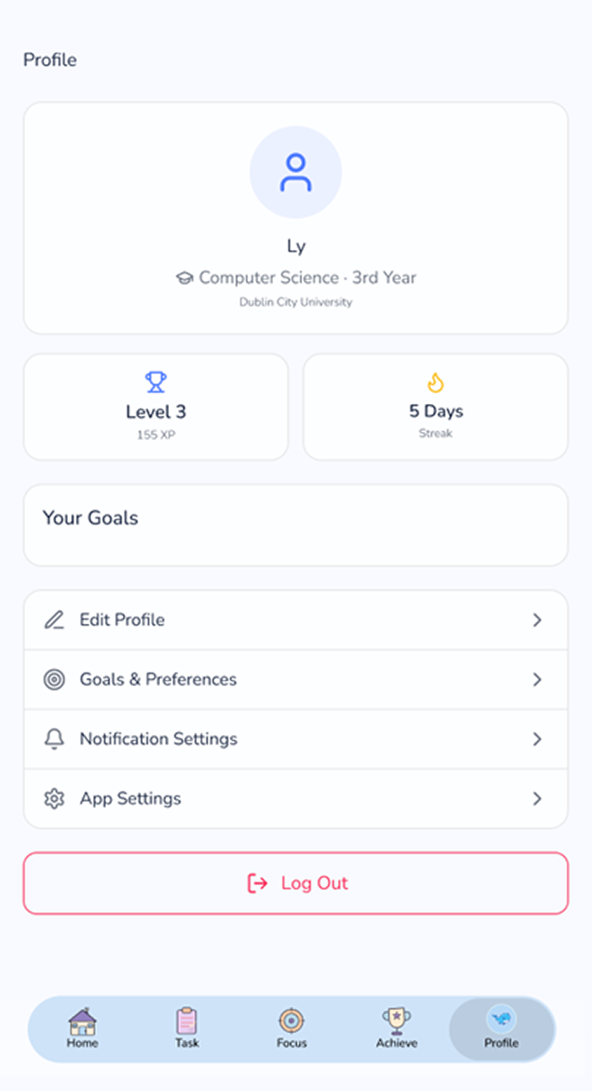
Methodology
A moderated usability test was conducted with 5 participants using the low-fidelity wireframe prototype.
The test focused on two main areas:
- Home screen
- Task management flow
Participants were asked to complete several tasks:
- Find where to start from the Home screen
- Add a regular task
- Add an unexpected task
- Manage and update tasks
- Understand how the schedule changes when a new task is added
During the test, participants were encouraged to think aloud while completing each task.
After the tasks, short follow-up questions were used to understand what was clear, confusing, or difficult to use.
Test Scenario
The test was conducted during the usability interview with a prototype link of wireframe, which focuses on the usability of the home screen and task management flows.
Wireframe prototype link: Wireframe Prototype
Findings
1. The home screen lacks a clear starting point
Users had difficulty identifying where to begin when first entering the home screen. The dashboard presents several elements at the same time, such as task lists, calendar information and gamification components, which divides attention and weakens the visual focus of the interface.
Design implication: The dashboard needs a stronger visual hierarchy, with one clear focal point such as "Today's Priorities" or "Add Task", while the remaining content should play a supporting role.
2. Priority information is not clear enough to support decision-making
The wireframe does not clearly communicate which task should be done first. Tasks are displayed with a similar level of visual emphasis, so users can see what they need to do but still cannot easily tell what deserves immediate attention.
Design implication: Priority should be made much more visible through labels, colour cues, ordering, or a dedicated section such as "Top 3 Priorities Today."
3. The Add Task flow requires too much manual input
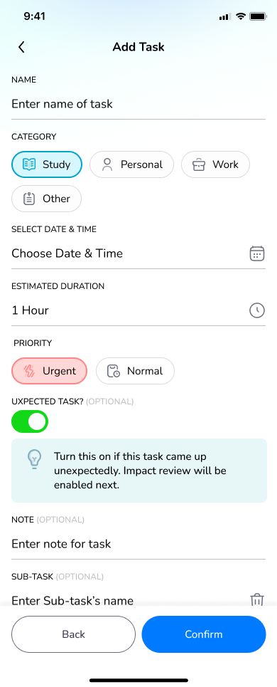
The Add Task flow creates friction because users are required to enter too much information in one interaction. Fields such as title, deadline, category, priority, reminder, estimated time, and subtasks are useful, but when they appear together, the process feels heavy and time-consuming.
Design implication: The task creation flow should be simplified so that only essential fields appear first, while advanced settings remain optional.
4. Schedule recovery needs clearer guidance
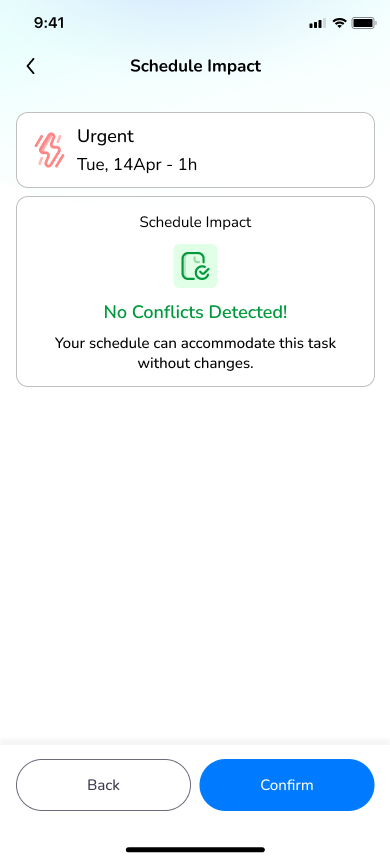
In the initial wireframe, rescheduling and recovery actions were not clearly structured or guided. When a task was missed or a new unexpected task was added, the system did not clearly communicate: how many tasks were affected, what would be changed, what options the user had, and how to recover the schedule confidently.
Design implication: In the final design, the recovery process becomes structured, transparent, and guided. The system clearly shows impacted tasks, which tasks will be rescheduled, and which tasks remain unchanged.
Prototype
UI Design